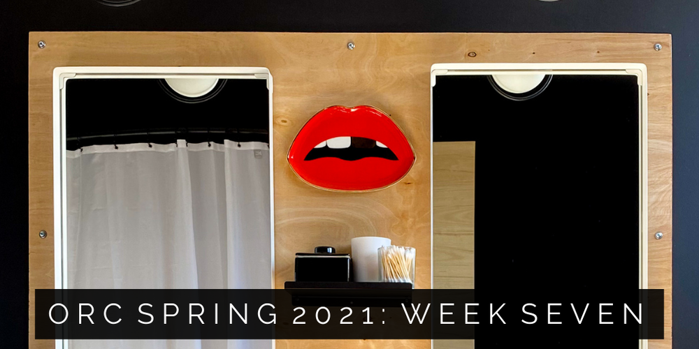
We’re one week away from the final reveal of this combo Bedroom/Bathroom space and it’s time for some styling! I’ve been clear that I am most inspired by art in all my designs. The instances of artwork and design in this space are singing. Here’s how I’m pulling it all together …

*this post contains affiliate links + advertising*
I get a commission when you buy through my links that goes towards the costs of hosting this free tutorial site.
site operating fees are expensive but my commission costs you nothing. thanks for your support!
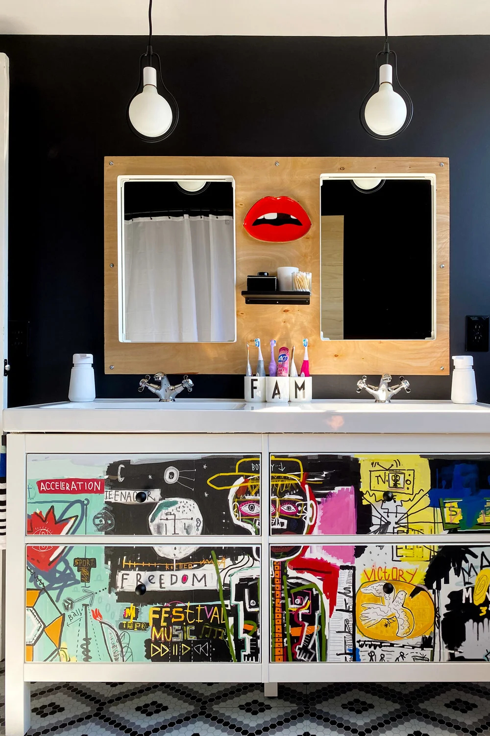
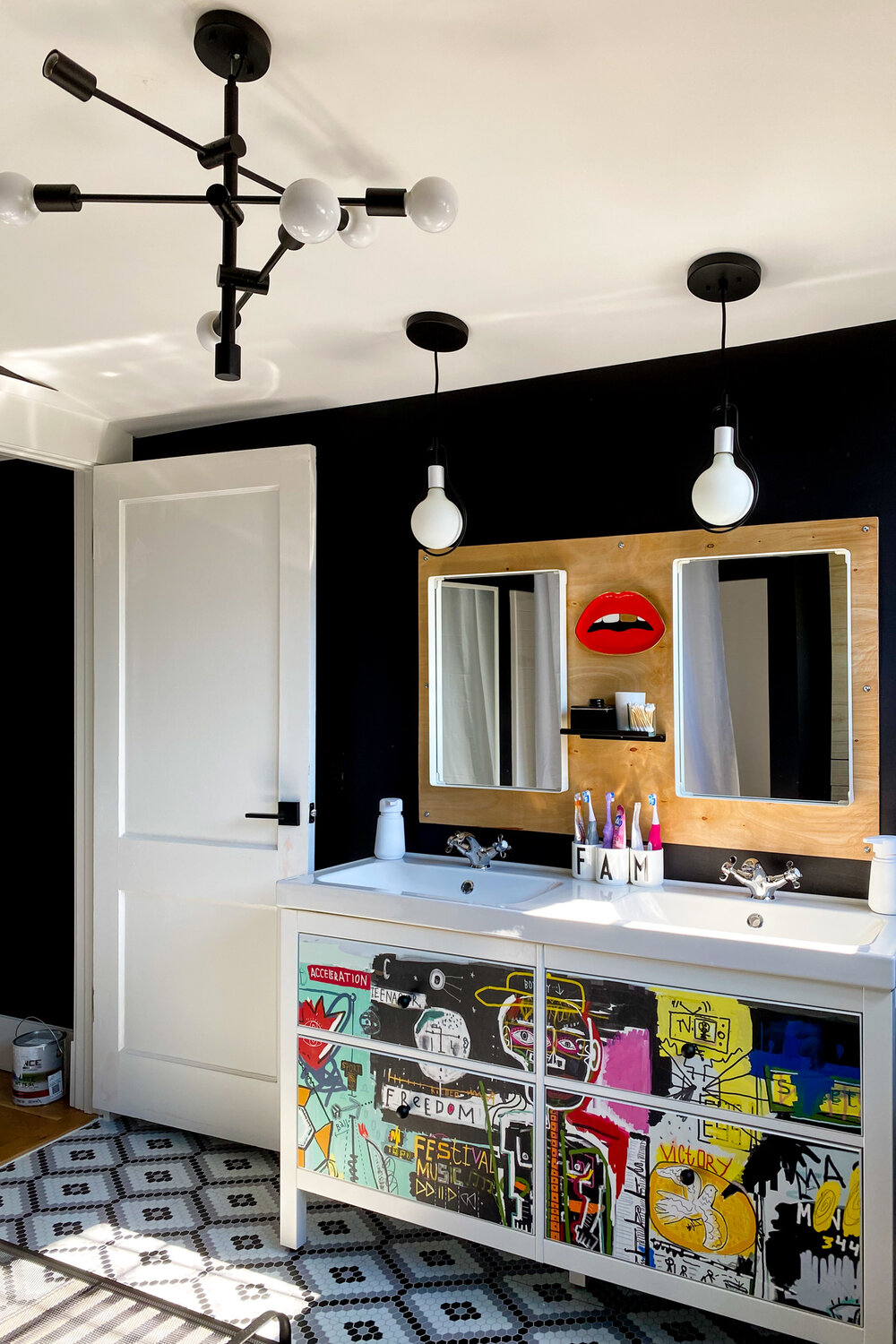
Last week, I showed you how I wallpapered the drawer fronts on the vanity and I’m honestly still not over it. I stare at it a lot. I love it so much.
Modern Bathroom Accessories
Fortunately, I was able to stop staring at my beautiful vanity long enough to tie up some loose ends this week:
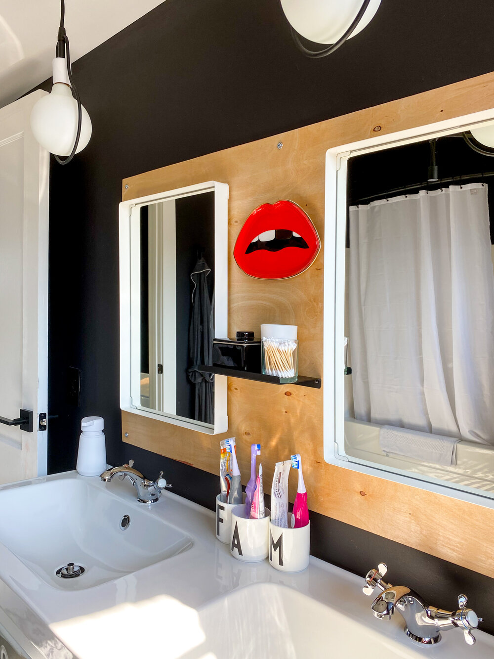
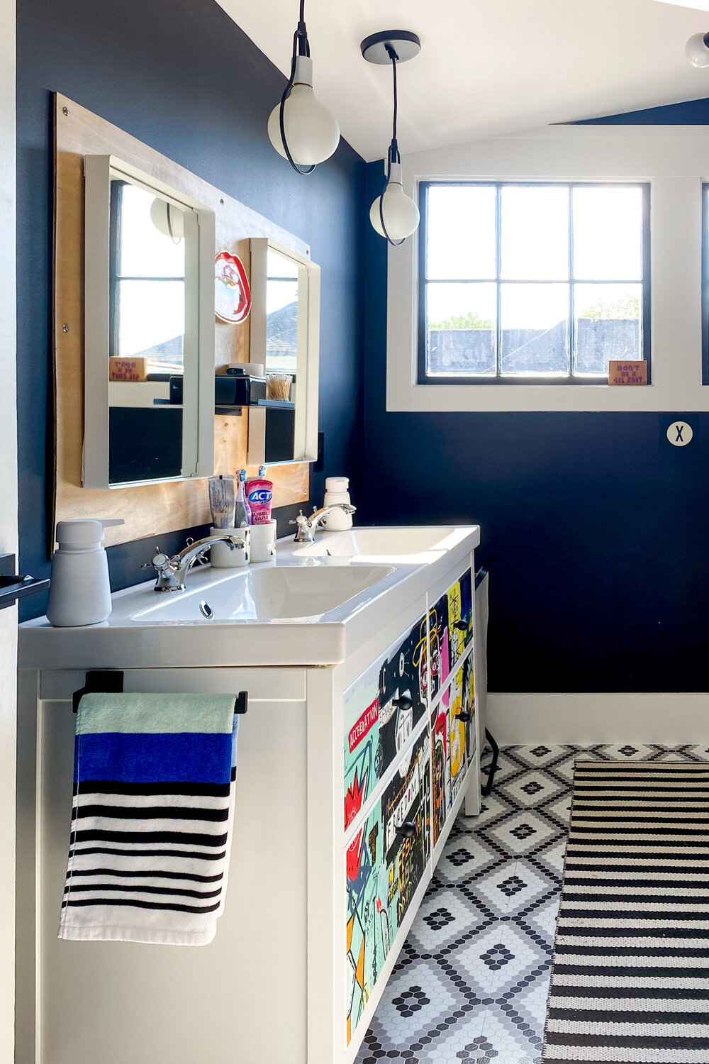
Like this little shelf between the mirrors. It’s holding our family’s daily grab-n-go paper products like cotton swabs.
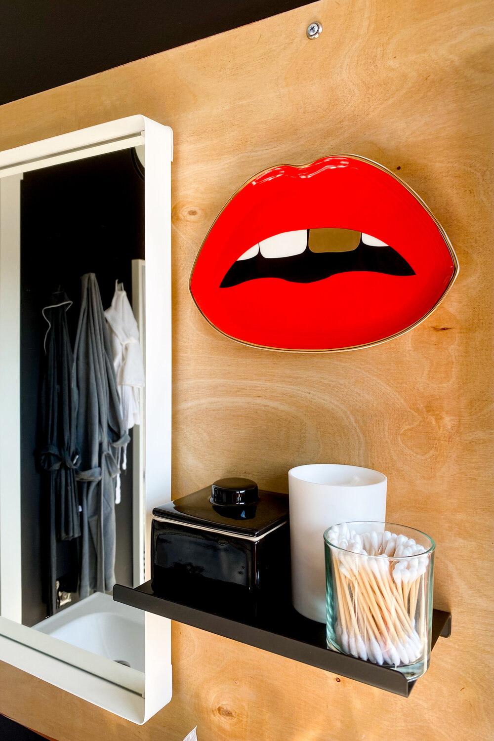
I also added these fun cups for storing our individual toothbrush and toothpastes:
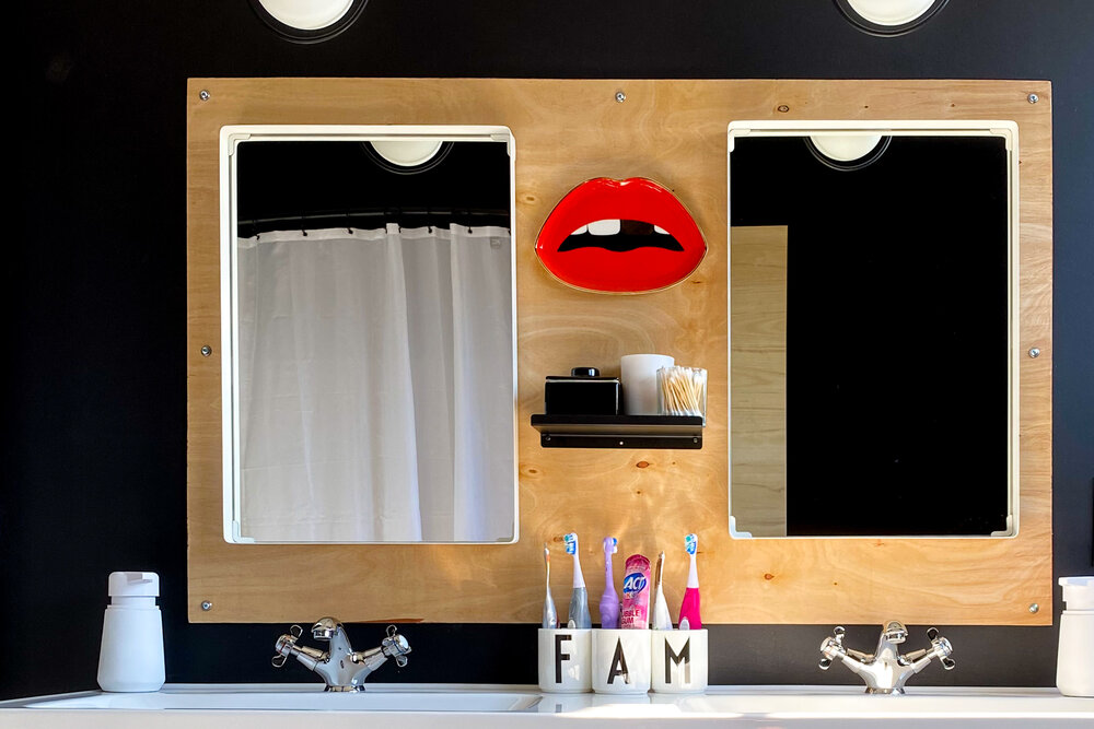
These porcelain cups feature a typeset designed by Arne Jacobson in the 1930s. This font is a staple in Modern Scandinavian decor and fits right in with the other Danish elements we’ve incorporated. For an extra layer of black and white, I also used his font on the wall hooks where we store our towels:
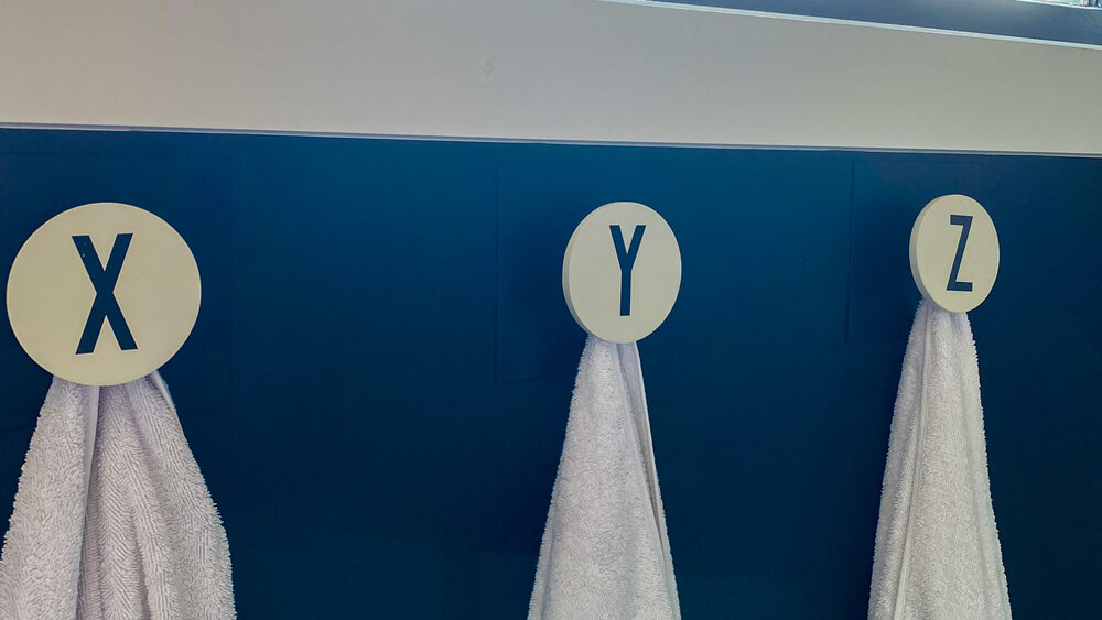
Since two of our family members share the same first letter of their names, I didn’t feel obligated to designated one hook or cup for each of us. Instead, I was able to play with the alphabet a little. Alphabet decor is a trick you see incorporated most often in children’s spaces but I like the playfulness it brings to this otherwise-grownup space.
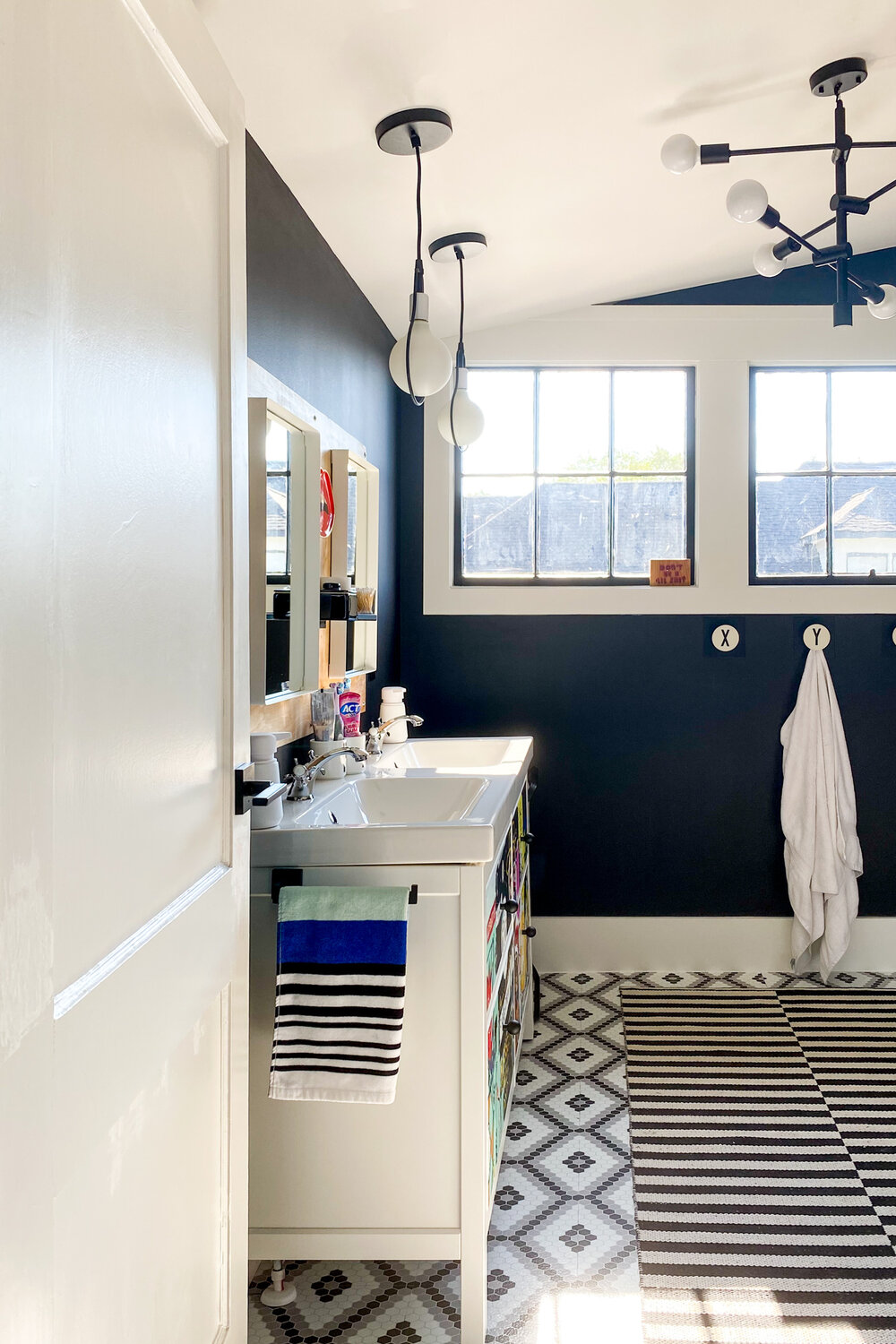
While I’m still awaiting the shipment that has our shower curtain, bath towels, and fabrics for the bedroom upholstery, I was able to find some new hand towels that complement the modern aesthetic and speak to the colors in the vanity without overwhelming the space.
I also used my free time this week to finish the vinyl tile installation and add the new rug you see above.
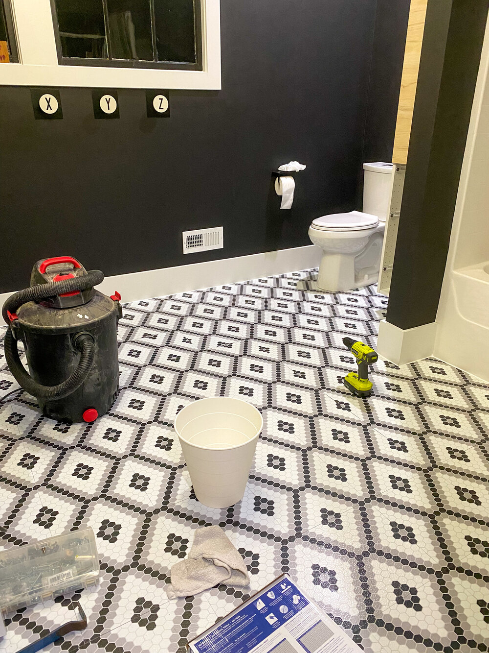
The addition of the black in the tile brings the room together. There may not be a ton of color in this room, but the visual interest isn’t subtle. The repetition of black and white in varying patterns adds a layered element without overwhelming the space with color.
Why neutral? When we rebuilt this house, I made a conscious decision to use only black and white wall and trim colors in order to bring the feeling of a modern art gallery. We have a large collection of art and it grows every time we travel. Unfortunately, we’ve never had a home where we could display most of our modern artworks because the styles of our previous homes didn’t match the art we love most.
All that changes now.
MODERN ARTWORK
The entire concept for these two rooms was born out of our artwork. The first piece, below, was given to our daughter as a gift when she was born by one of our closest friends and her play aunts:
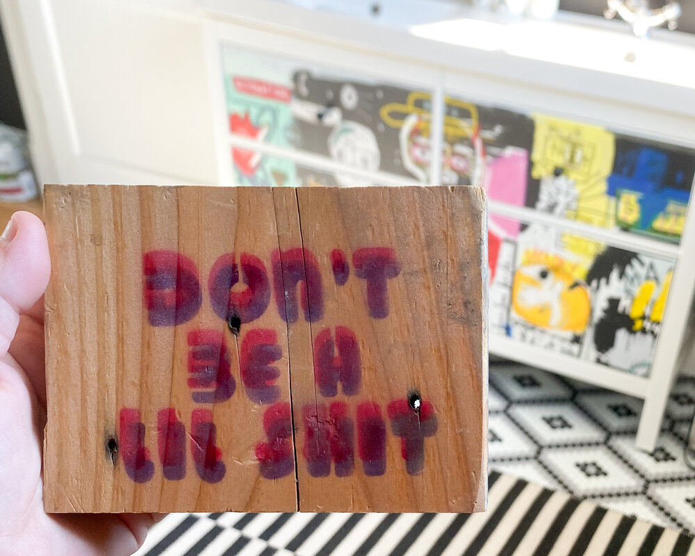
It was damaged in the tornado, but I was able to salvage it. This original graffiti-style piece was created by Nashville-based artist, Mayeli Art and served as the inspiration for bringing in street style to this room.
While I was traveling, I found a beautiful print by New Orleans-based artist Veronica Casares Lee that had the colors and overall tone we were looking to incorporate in the bathroom.
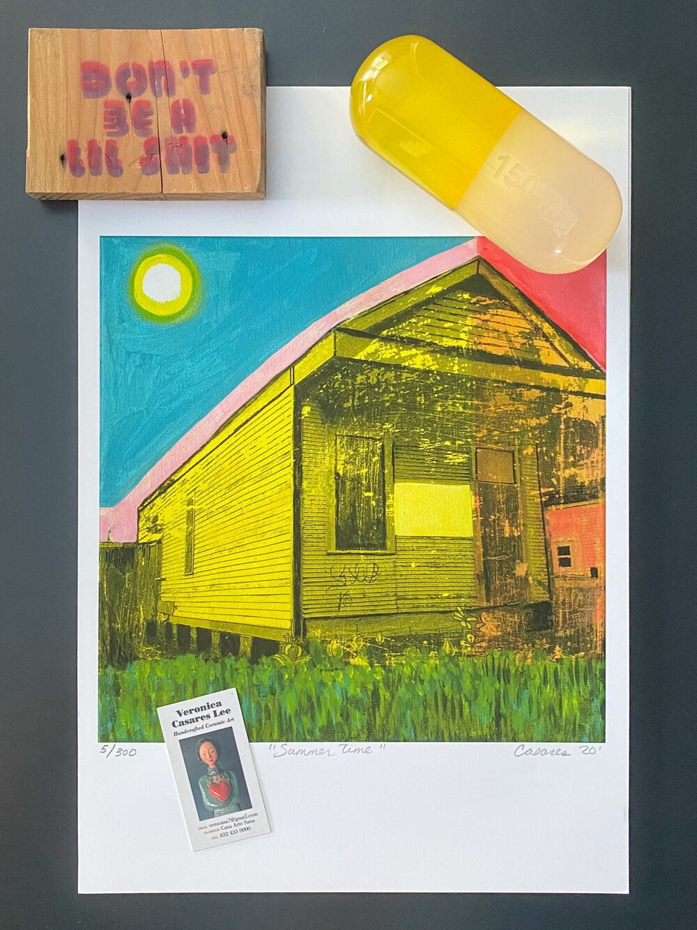
Her print, above, complements the existing art pieces (wood block and Jonathan Adler Acrylic Pill Statue) I’d already intended to use in the space.
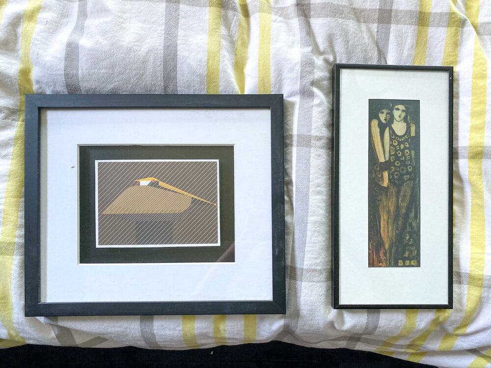
The artwork shone above is from our collection. We’ve had both these pieces for a number of years and, once cleaned up from the tornado debris and storage, they’ll be installed behind the bed to offset the window. When complete, the installation will look like a trio of artwork with our original historic window as the centerpiece.
OTHER BEDROOM / BATHROOM UPDATES THIS WEEK
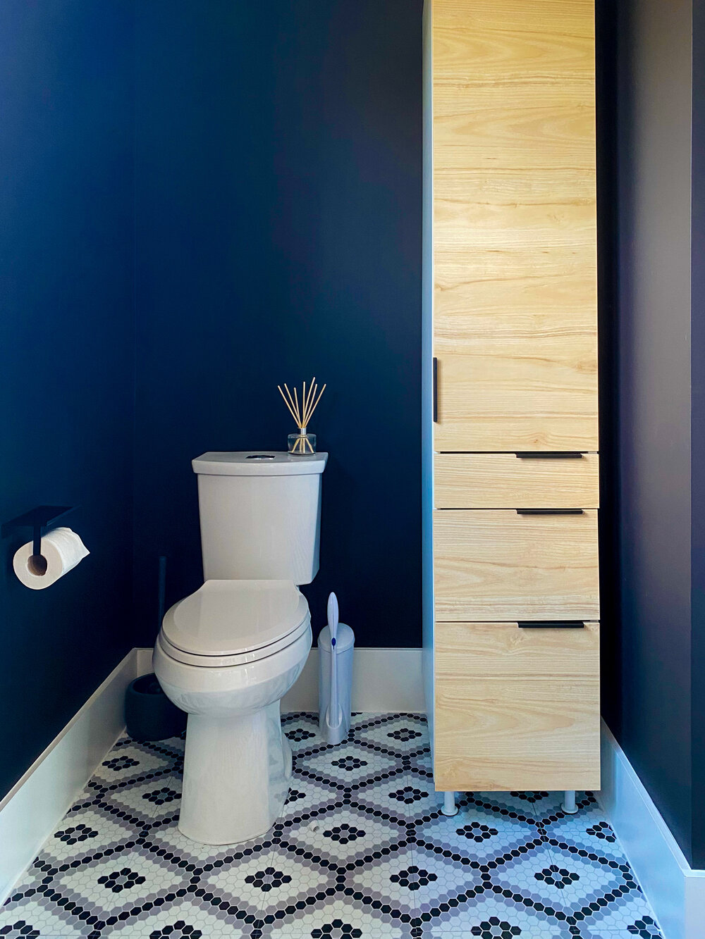
After months of debate over which handle style to install on the freestanding storage cabinet, we finally handed on simple edge pull handles so we can more easily access the items we need.
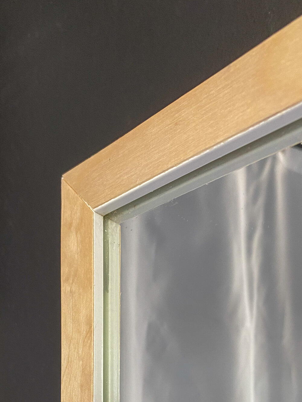
To add another wood element, and offset the starkness of the black and white, I applied a simple veneer edge banding to the existing white Ikea mirror. This moment, by the shower, will call to the wood on the mirror vignette and the freestanding cabinet.
WHAT’S LEFT TO BE DONE?
It wouldn’t be an ORC if I weren’t stressed ‘til the last minute, right? There’s a lot that still needs to happen and a lot of materials we’re still waiting to receive. Here’s my list;
custom shower curtain - waiting for fabric
bed reupholstery - waiting for fabric
art installation - waiting for two new pieces
styling
possible surprise project (if the materials arrive in time)
pro photographs of the completed spaces
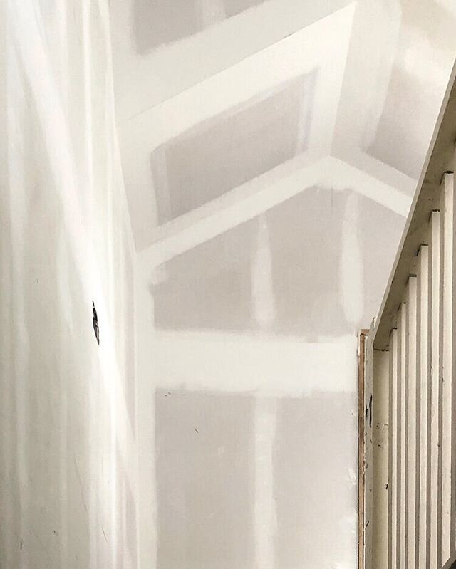
Here’s where we stand as of today:
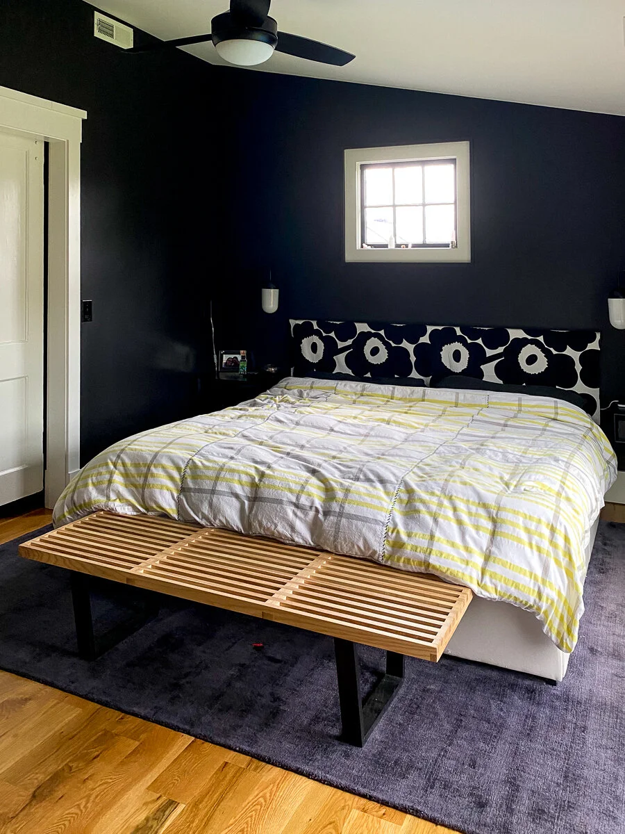
Do you think everyone else is farther along in the game by now? You can go check in with everyone else by clicking this logo image:
If you’d like to catch up on the entire progress of this Principal Bedroom / Bathroom makeover, you can read all of the updates from this season’s ORC here:
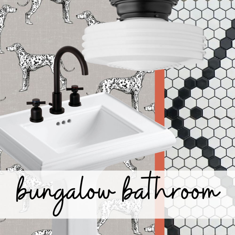
Below, you’ll find design concepts and shopping lists for everything I’m incorporating into these two rooms:
See you next week! Until then, stay safe and sane.
xoxo
Teri
DECORATING ON A BUDGET ISN’T ALWAYS EASY BUT I’M HERE TO HELP.
Commenting on this post is disabled so I can focus on our upcoming projects + client designs but that doesn’t mean that I don’t want to hear from you. Send me your questions and comments on Instagram by either commenting on my latest post or sending me a direct message. I really love to chat it out!

is site contains affiliate links + advertising*
I get a commission when you buy through my links that goes towards the costs of hosting this free tutorial site.
Site operating fees are expensive but my commission costs you nothing. thanks for your support!
NEED MORE HOME DECORATING IDEAS + INSPIRATION?
THESE ARE THE MOST POPULAR THIS WEEK:
