In this Hoboken home remodel, a kitchen and bathroom modernize with black, white, and wood
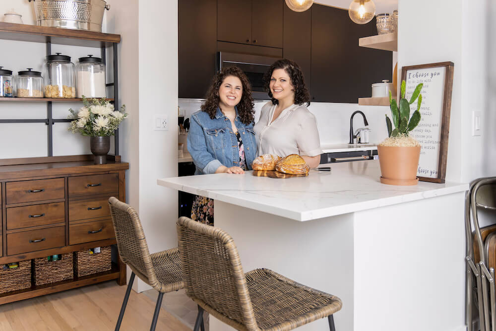
“After” photos by Jeffrey Rosenberg Photography for Sweeten
- Homeowners: Danielle and Michelle Dobrusin found their general contractor by posting their Hoboken home remodel on Sweeten
- Where: Hoboken, New Jersey
- Primary renovation: Gut redos of both kitchen and bath for their new condominium in a converted 19th-century schoolhouse
- Sweeten general contractor
- Sweeten’s role: Sweeten matches home renovators with vetted general contractors, offering advice, support, and up to $50,000 in renovation financial protection—for free.
Written in partnership with homeowners Danielle and Michelle
Remodeling a converted condo in Hoboken, New Jersey
We purchased our home in June 2020, a 1,100-square-foot condominium in a former 1800s schoolhouse. The downtown Hoboken, NJ building was converted into condos 30 years ago, and we love its character—our apartment has 24-foot ceilings with original wood beams.
We are Danielle, an attorney, and Michelle, a human resources manager, and our plan was to move here with our two cats, Sylvia and Eleanor. We knew going into the purchase that we would renovate the kitchen and bath. Both needed a facelift. We posted our project on Sweeten, with accurate specs, and soon got responses from contractors interested in working with us. It wasn’t long before we found a contractor we felt was a great fit.
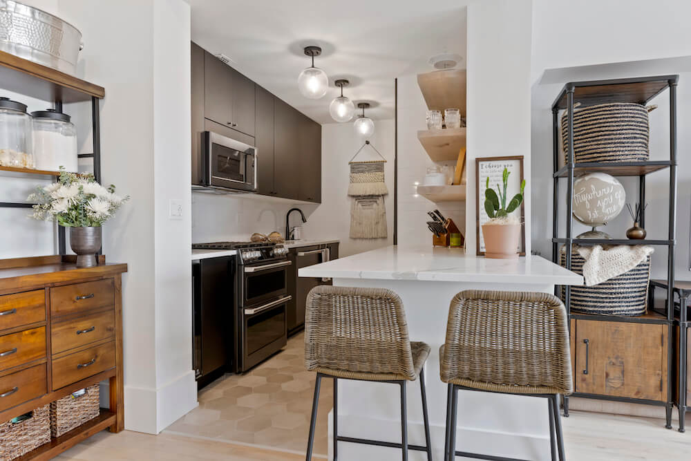
Our goals for the renovation were easy to convey, since the existing rooms’ shortcomings were obvious. The kitchen was closed off from the rest of the living area and outdated—we wanted to open it up and connect it to the living area. It was not only badly designed, but in poor condition, too. The cabinets were falling apart; we had to lift one of the doors with a foot to open or close the dishwasher. The bathroom was also in bad shape, with cracked tiles and water damage.
A black kitchen, bold yet neutral
We wanted our remodel to be clean, modern, and simple, but still a statement. In 5 to 10 years, it should still look updated. We chose black cabinets and other features because they would stand out and look timeless. Neutral tones would complement decorative accents, and we like the clean feeling of white surfaces. We also wanted natural elements that would tie to the condo’s existing wood floors and warm up the space. We felt the palette would come together to create a modern, edgy vibe.
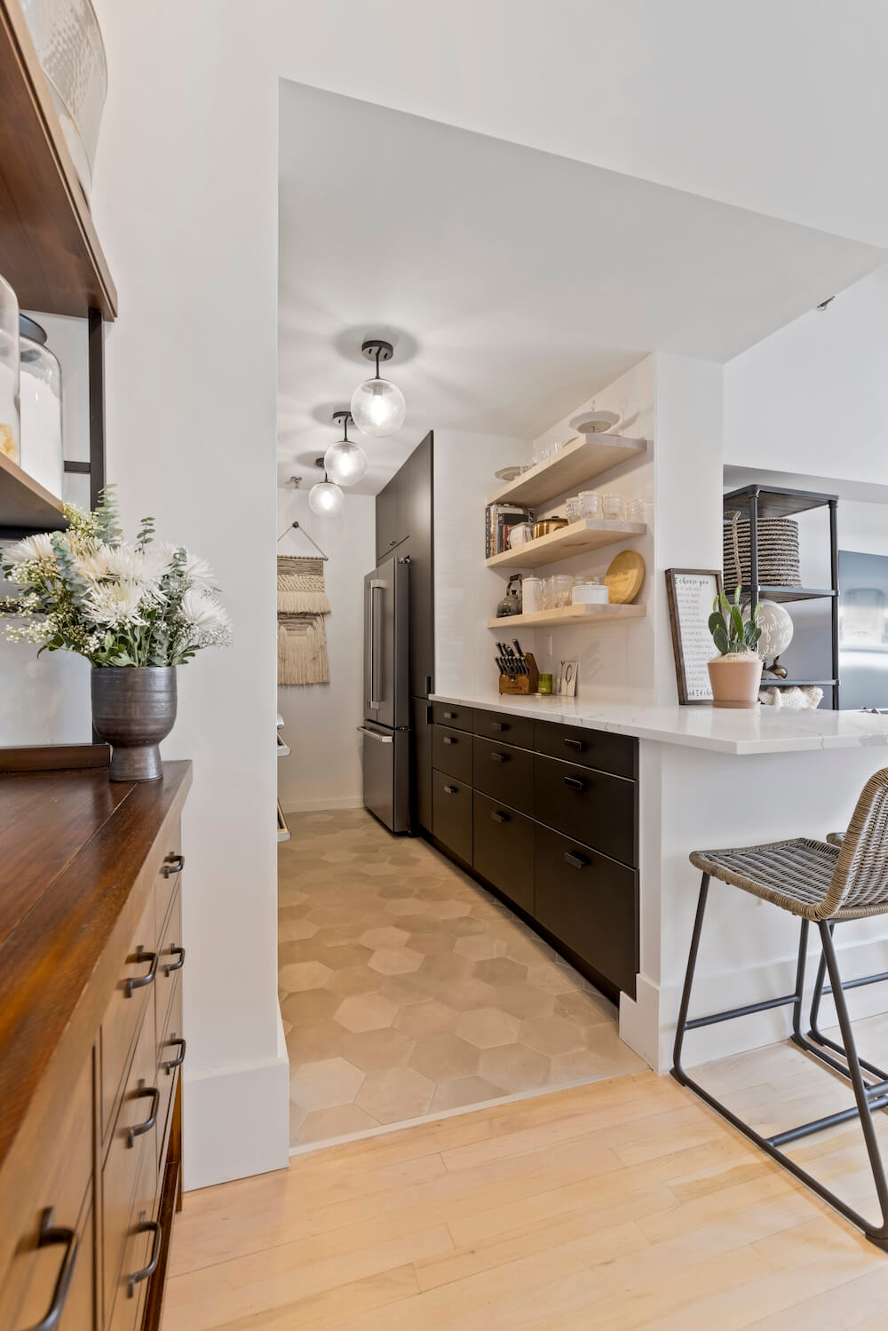
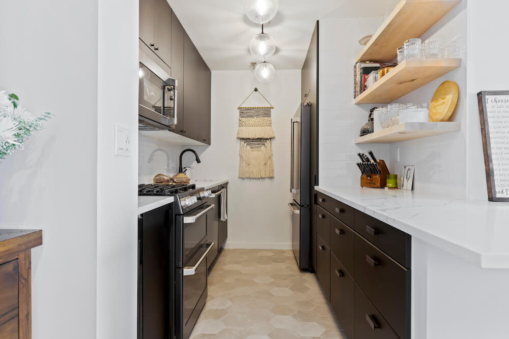
Our objectives in the kitchen included opening the room, increasing storage, and tailoring the cabinets and drawers to our specific needs. Seating would be added to the design to keep the cook company during dinner prep.
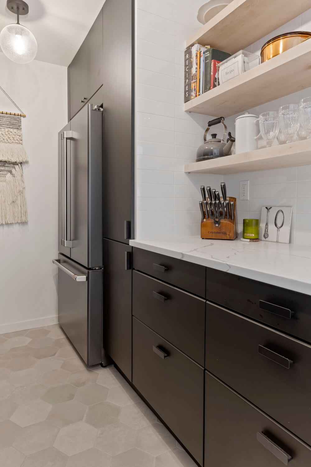
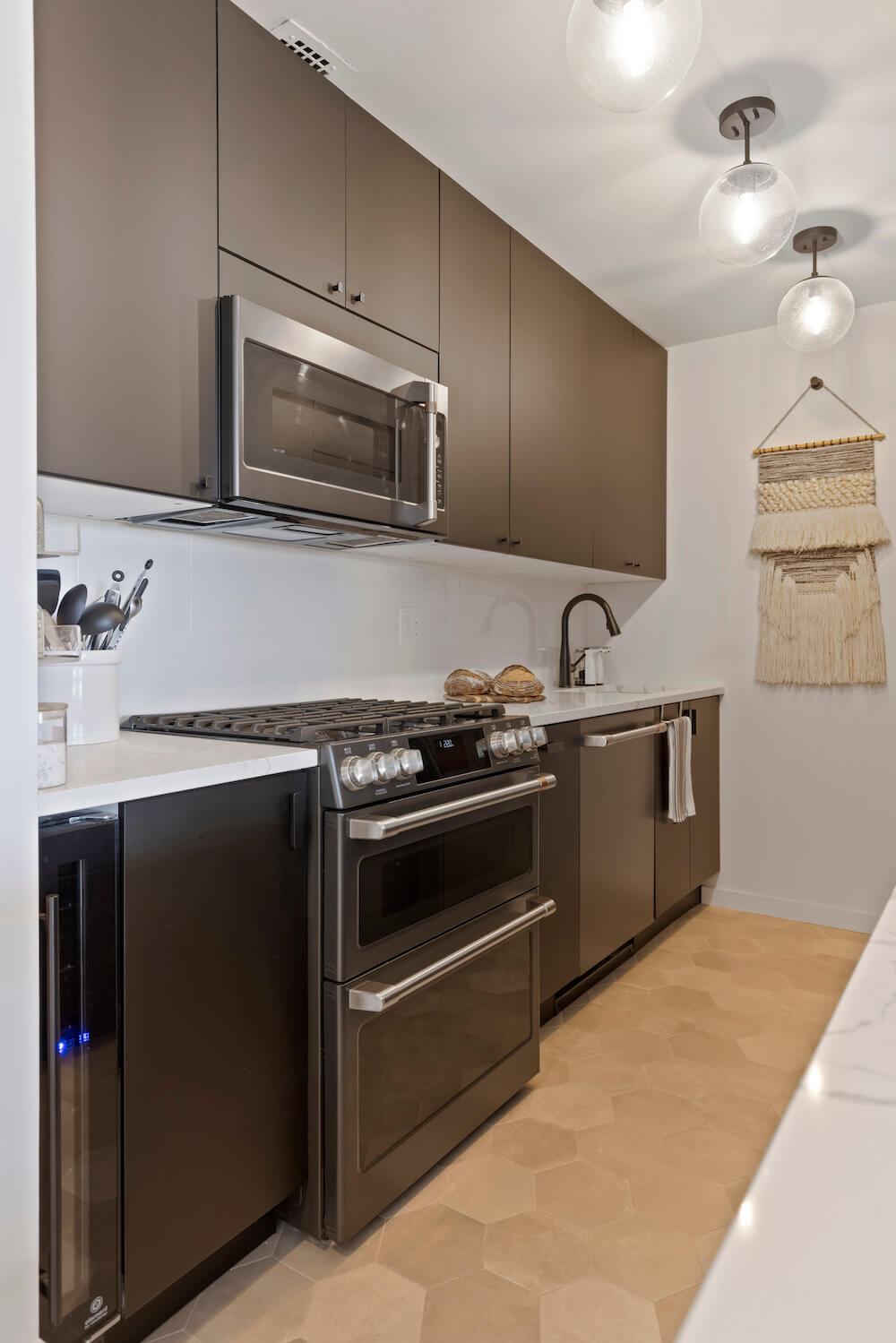
In planning the layout, the inclusion of base cabinets with drawers to maximize storage was important to us. We wanted, too, to add a pantry, which the kitchen did not previously have; we managed to fit it in just right of the fridge. We were excited to find matte black cabinets—they look expensive but were more affordable than traditional cabinets, and almost as customizable. Plus, they’re made from recycled plastic! The wooden floating shelves add not only a natural touch but easy-access storage for dishes and glasses.
Creating a home baker’s kitchen
The plan also included new appliances and we decided to splurge on a high-end package. Danielle is an avid baker and successfully jumped on the sourdough bandwagon when the pandemic began—she loves being able to preheat the oven from her phone. We were set on a full-size fridge with an ice maker. We also fit in the world’s smallest wine refrigerator, at about six inches wide. We don’t drink much but love to have a few cold bottles on hand—this fridge holds seven.
Wallpaper and black paint for a bathroom
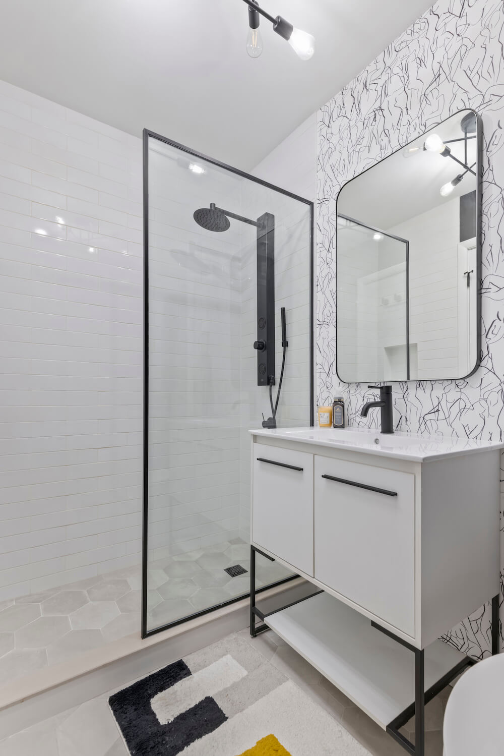
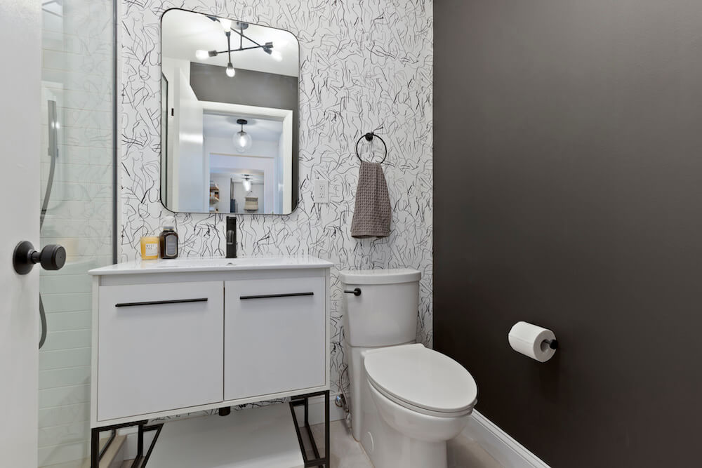
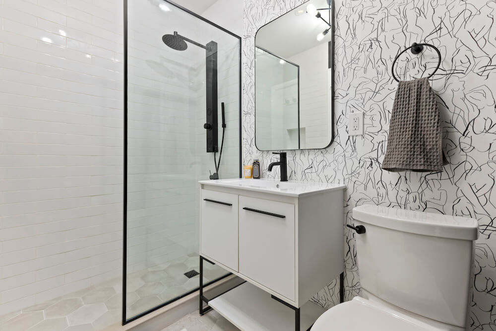
For the bathroom, we wanted to go simple and coordinate with the kitchen. We wanted the space to feel connected, and to that end, we kept to a similar neutral color scheme and same tile shapes. We installed a glass shower, knowing that the transparent walls would make this space feel bigger. In any case, we already have a tub upstairs. We went with a statement wallpaper. We thought it made sense to go playful in the small bathroom.
What we did participate in was shopping for all of our materials, creating our vision and the end result!
Managing during the home remodel
As first-time renovators, we were unsure about the timing of various phases and what the overall costs would be. We talked about when the materials, which we sourced on our own, needed to come. During the renovation, we retreated to Danielle’s parents’ home in Arizona. The condo is an open loft and isn’t conducive to phone calls—we didn’t think it would be possible to live, work, and renovate from home. What we did participate in was shopping for all of our materials, creating our vision and the end result!
It was hard not being able to see the project’s daily progress, and to step back from our inclinations to micro-manage. But we did. We communicated our choices and concerns to our Sweeten contractor, from afar, usually over texts or on phone calls. Our contractor was patient and sent pictures as progress updates. Along the way, we learned the importance of communicating—ask questions and tell your contractor what you want, as you are your best advocate.
Since we had a great relationship with our contractor, and we made all of the budgetary and design decisions, we didn’t end up needing to use some services Sweeten had to offer. Still, we were grateful for the match with a contractor we knew was vetted. We felt peaceful knowing that Sweeten had our back if an issue were to arise.
Tips on staying on budget
If we had one piece of advice to share, it would be about the budget. Figure out what your limit is—the one that you can actually afford. From there, expect a few unexpected costs. Go through your projection line by line with your contractor and be clear about what isn’t included in their quote. If money is a concern, pick a few pieces you’re in love with to splurge on and go for more affordable options for everything else. We paid about $50,000 for both rooms, all-inclusive of work and materials. We went for the pricier appliance package, which cost about $8k.
It’s such an incredible feeling to transform a space into exactly what you want and what you need. We’ve never experienced that before. We now understand the appeal. Amazing! At home! It was worth every penny.
Thank you, Danielle and Michelle, for sharing the results of your Hoboken home remodel with us!
Renovation Materials:
KITCHEN RESOURCES: Cement Nord hex porcelain tile: Tile Shop. Meringue II Canvas polished ceramic tile: Floor and Decor. Precis Silgranit 23″ L x 18″ W undermount kitchen sink in white: Wayfair. Matte black Delta Lenta Touch2O pull-down kitchen faucet: Lowes. Counter-depth 23.1 cu. ft. matte black fingerprint-resistant smart French door refrigerator: Home Depot. Cafe fingerprint-resistant built-in 24” dishwasher with 45 dBA in matte black: Home Depot. Matte black 30” slide-in smart double oven gas range with self-cleaning convection: Home Depot. Seven-bottle 5.8” touchscreen wine cooler: VinoTemp. Maple floating shelf with hidden bracket: Ultrashelf. Kungsbacka cabinets; Hackas knobs and pulls: IKEA. Calacatta Laza countertop: MSI.
BATHROOM RESOURCES: Cement Nord hex porcelain tile: Tile Shop. Meringue II Canvas polished ceramic tile: Floor and Decor. Wrought Studio Aminata 30” single bathroom vanity set: Wayfair. American Standard Clean 2-piece WaterSense toilet in white: Lowes. Lady Body wallpaper: Chasing Paper. Linden toilet paper holder and hook: Pottery Barn. Gardenia 2-spray shower panel in black matte; framed fixed glass shower screen: Vigo. Modland single hole bathroom faucet; Miki traditional accent mirror: Wayfair. Semi-flush mount ceiling light with 6 bulbs: Amazon.
—
Sweeten handpicks the best general contractors to match each project’s location, budget, scope, and style. Follow the blog, Sweeten Stories, for renovation ideas and inspiration and when you’re ready to renovate, start your renovation with Sweeten.
The post My Sweeten Story: Neutrals Go Bold in a Hoboken Remodel appeared first on Sweeten.
